Wednesday 30 March 2011

Ongoing in class task: Perspective Drawing and 3D Rendering Techniques


This booklet took us through different types of shading (simple, line, and 3 tone shading), single, and two point perspective drawing techniques. Combining these two; shading and perspective, a 3 dimensional drawing can be effectively achieved. 
I found line shading confusing at first, as I am used to using simple gradation shading. Line and Three tone shading just gives an idea of which sides are lightest and which are darkest. I  don't think these are as effective as gradation because the lines and different blocks of colour on a shape, I find, distract the viewer from their purpose, like they are there for decoration rather than depict light and dark. Though this could be because I am not used to the idea of them yet. I have also learnt all about vanishing points, how they work and their purpose. Here are some pages from the workbook!
Single point perspective drawing

Single point perspective drawing with three tone shading added

Single point perspective drawing; filled in extra lines to create the third dimension to the drawing.


Tuesday 29 March 2011

Observational Sketches

This is also a little late but it was only today that I took photos of my work, both the map and this drawing. This task was to help with our drawing, imitating what we see and decribing it visually in a certain medium. This drawing was done in charcoal and is of some sort of cardboard chair model, a pile of magazines, a scrap of cardboard and a basketball. I think a successful aspect of this work is the proportion, everything is the right size in relation to other objects. I think that if I had more time to do it I would have put in more shading. This would provide perspective and therefore a better idea of the still life arrangement.

Concept Development: Greenpeace Poster Design

I had originally planned to design a poster for the RSPCA, though I heard a few people were thinking of it and I know a fair bit about the RSPCA already, so I decided to look up an organisation I didn't know much about. On this page I brainstormed a few ideas for the poster, found out some of the events and fundraisers that the RSPCA holds and what they do for animals.

I chose to look up Greenpeace. I roughly found out what main issues they deal with and what their goal is. After researching some of their poster designs I made an attempt at thinking up some of my own that could be as clever and eye catching as theirs. Greenpeace being an organisation that deals with wordly issues like the environment, I tried to bring images of the earth into my designs. Also issues like overfishing and whaling, Climate change and their effect on human life.


Concept 1. This is the first idea that popped into my head, the world as a deflating balloon due to climate change. I think this visual metaphor could work really well. It's simple and direct, the image is in your face and easily interpreted. Colours are kept plain as to maintain attention on the concept of the image rather than the detail. "We're running out of puff" This poster has the potential to be quite appealing to young people because it is straightforward and eye catching. 

Concept 2. This concept is a little more specific to the overfishing issue, though the idea is broadened with the caption "Spot the difference" as in life and death. This one takes a little bit more time to comprehend and the image isn't as striking either. 

Concept 3. In carrying out my words with actions, I designed a poster with humans in it. I haven't seen a great amount of Greenpeace posters with people in them and I think it could really hit home if they did use them. This one is half joking, saying that if pollution continues as it is, in a few decades time we won't be able to breathe our own earth's air. A photo would make it very realistic, with the short caption "Act sooner rather than later"

Sunday 27 March 2011

Wordless Map Evaluation

This is a bit late, but better late than never!
For this task we formed a group of three and on butcher's paper created a map from the Graphic design room to the Textiles room, using no words. The objective of this task was to get us thinking about how images are used in design to direct and give the viewer a straightforward understanding of their purpose. These are descriptive images.
We basically drew three blocks, one with computers (F06), one with lockers and lunch tables (Canteen) and one with stairs, dresses and sewing machines (Textiles room). With an arrow between each we created a clear map directing whoever was to view it from F06 to the textiles room very simply.

It is difficult to make out because it is in pencil so the first drawing is the Computer room, the second is the Canteen and the third, Textiles room.

Thursday 24 March 2011

Adobe Illustrator Caricature!

For this exercise we had to take a photo of ourselves, upload it onto illustrator, trace all facial lines with a pen tool and then manipulate it so it becomes a caricature. 
A caricature is a portrait that exaggerates usually the features of a person and sometimes the whole essence of a person so that it is humourous or possibly insulting.
I found the task quite difficult at first because the pen tool took a fair while to get used to. Then when I had gone to start editing the pen trace I realised i probably needed more lines to create a more substaintial image, and back I went to the original tracing. I experimented with the warp tool first - very entertaining, and then did a lot of work with the direct selection tool, which allowed me to change the size, shape and direction of original lines. 
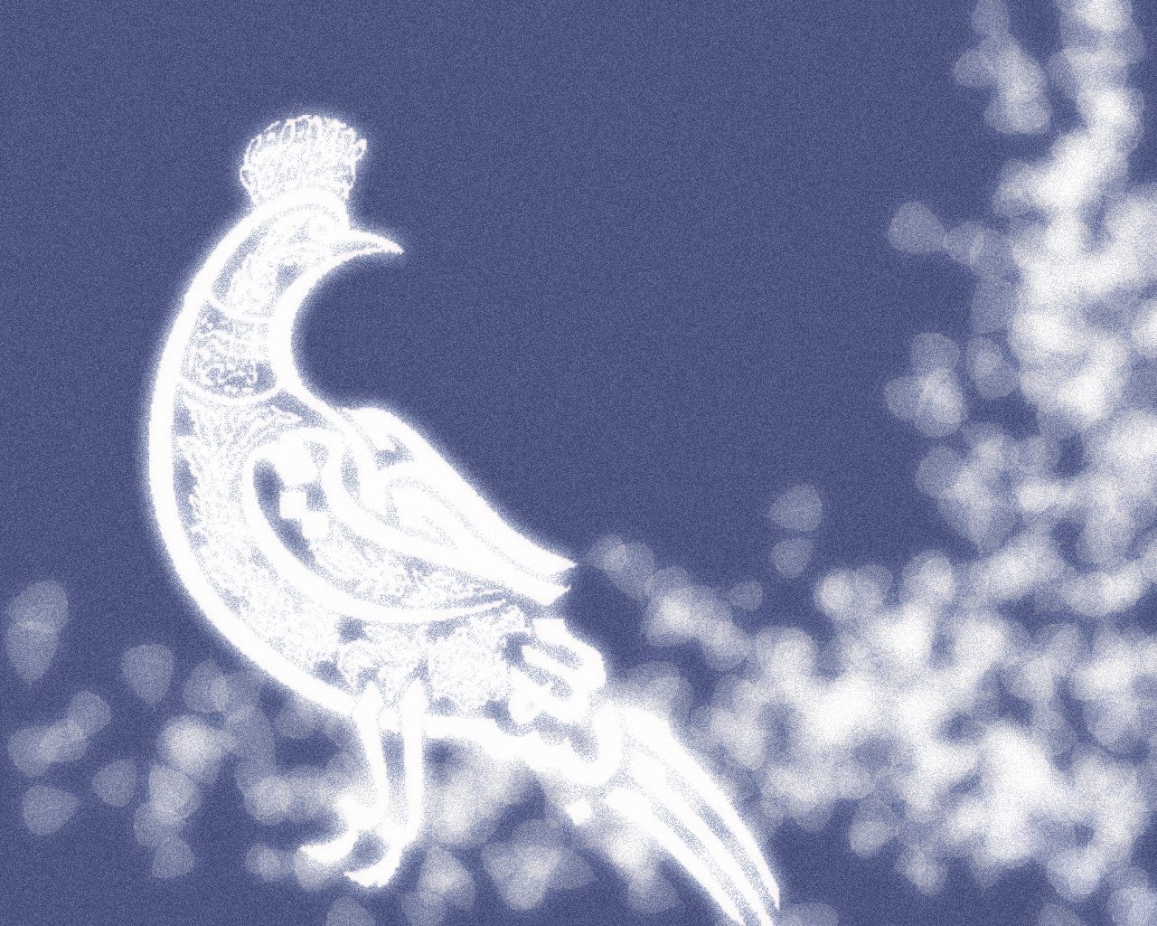
I changed the shape of different facial features to exaggerate something about them; i have a pointy chin so I made that really big, asian eyes so I made them small, made my eyelashes ridiculously huge to make fun of the fact that I wear lots of mascara, a bobbly nose so i made that fatter and make my hair extra poofy because that's how it sits on my head most of the time. The result is a caricature that looks like a transvestite with tiny eyes. Or Robbie Rotten from  the kids show Lazytown (pictured below).
To improve it I should probably have spent more time on it and thought about what I wanted to do rather than play around with everything. Also the photo taken was quite dark so not all of the facial lines like around my eyes or my teeth showed up very well, making it a little more difficult.
Overall this was an enjoyable task and though my caricature is ridiculously ugly, I feel I know and can use illustrator a lot more confidently than before.

Original photograph


First attempt: not enough lines and a bit too much fun with warp tool.

Second attempt: much better in terms of lines drawn and looking more like me. Not yet manipulated though.

Final caricature: should look more like me but at the same time I hope it doesn't look much like me, it's pretty ugly.

Like this guy, Robbie Rotten.


Monday 21 March 2011

Greenpeace posters

Roughly translates to: "What if it was you next?"


Roughly translates to: "Watch out what grills this summer"


Sunday 20 March 2011

Major Project 1

For my Major Project I have chosen to design a poster for Greenpeace. 
Greenpeace is an independent global campaigning organisation that acts to change attitudes and behaviour, to protect and conserve the environment, and to promote peace.
Greenpeace uses non-violent direct action to expose global environmental problems and to force solutions which are essential to a green and peaceful future.

Their goal is to ensure the ability of the earth to nurture life in all its diversity.


How long has this organisation been established?
Greenpeace evolved from the 'Don't make a wave' committee in Vancouver in the early 1970s.


Can you find any past advertising materials, as well as present? How have these changed over the years, and what do you think these changes have been influenced by?
It has been difficult to find out the dates of Greenpeace posters and materials, as posters, the website and the images found on the internet do not really specify. 
I do definitely think though, that any changes that would have taken place in terms of poster design over the years would have developed from use of modern technology. Things such as photoshop and other editing programs, constant improvements in photography, and the public being more informed in general of wordly issues because of mass media, would alter how Greenpeace designers would go about their work. 


Is the current advertising appropriate to the organisation? why/why not?
I think the current advertising for Greenpeace is very appropriate. They have a great range of pieces from simplistic to detailed, but the message never fails to come across to the viewer loud and clear. The subject of the advertising is also completely varied, Greenpeace doesn't have a single way of producing advertisements, the concepts are all appropriate to what the organisation does. Work can go from realistic, to cartoony, to unnatural, which ensures that Greenpeace holds the viewers' interest with every image, people won't glance at it, recognise it and then ignore it, they will look and be intrigued, then continue to find out more. It's a very successful approach!


How could a different design be more appropriate?
I think the current designs are quite effective, though one thing they could incorporate is people. Not much of their work has humans in them, and I think that if people saw humans in a Greenpeace design, in their signature striking way, it would really hit home for the viewer and make the viewer realise they have to do something to save themselves, the planet, other people and the future. It could really put the viewer in the shoes of the design's subject matter. 

Saturday 19 March 2011

AMES BROS

"Ames Bros is a Seattle based company producing award-winning design & illustration.
Ames Bros specializes in print design, logo design, and web design. Our clients include Pearl Jam, Nike, NBA, House of Hoops, Mtv, Virgin Mobile, Rayban, Converse, Absolut Vodka, John Mayer, Phish, Nascar, EA Sports, Bonnaroo, Cooper Mini, Harley Davidson, Linkin Park, Got Milk, NFL, Hard Rock Cafe, The North Face, AOL, EMP, Washington State Lottery, Billboard Magazine, Total Cereal, Honda, Nissan, Sting."


http://amesbros.com/


I love Ames Bros' work! They are modern and fun and versatile - they design for everything from spreads for Nike, to posters, to clothing. Their designs almost resemble pop art because they are so colourful and bold. 


Wednesday 2 March 2011

Abstract Image Analysis 3

My last abstract image is that of a bird. For this image I didn't do very much, as the bird was fairly prominent and detailed I was happy with leaving the background quite clear. First of all I made the background a light purple colour by going to Layer>new fill layer>solid colour. Then I created a brush using a pretty image of a bird I found on google. Trying several times to find a colour that suited the purple background and finally settled with white, goes with everything. The image was looking a little empty so with a brush that produces a bunch of leafy images at once, I decorated the image from the bird's tail around and up the side. Next I used an effect 'Diffuse Glow', which makes the image look heavenly. I like this image but it isn't really abstract. The colours are lovely and I like this effect with it.


Tuesday 1 March 2011

Abstract Image Exercise Analysis 2

My second Photoshop abstract work was created mostly with the use of different brushes and a colour swatch I created of warm complimentary colours. Beginning with a large round brush I drew some random lines in a bright reddy/orange colour and played with the liquify tool again to create some interesting shape. I then tried out a brush that produces several shapes when you click rather than just one spot of a particular pattern. Using this brush I painted on some light pink leafy looking shapes. This formed some texture and varying tones. With the big empty space on the right I decided to stamped in the places lacking in colour with an extremely large brush. The green creates a subtle contrast in colour and fills empty space. I did this again with a different brush in a pink colour to match but this time in the bottom corner. In class we then learned how to create our own brushes and so I created the flower brushes used in the bottom right. I think these helped balance the image. The red spiky shape has lines that lead towards them and the enlarged pink brush also gets more dense as it gets closer to the flowers, drawing attention to them. I think this is a messy abstract image but takes into account colour and creating brushes which was suuper easy and cool to learn.

Monday 28 February 2011

Abstract Image Exercise Analysis 1


For my first piece, I first of all experimented with different brushes. With brush 100 I changed its size to something large and drew some swirly, circular lines. Definitely needing to be more complex and visually interesting, I looked through the ‘Filter’ tab and opened ‘Liquify’. I really like this tool as you can mush up the image in lots of ways, adding soft swirls and sharp edges, making the picture quite eye catching. Going back into the ‘Filter’ tab I picked the ‘film grain’ selection. I found that the ‘Sketch’ selection had a good range of effects that would make the image appear more abstract, though I was happy with it already so didn’t select anything from there. I then moved onto editing the colour of the abstract work. I altered the contrast, hue and saturation until the colours were really bold and striking. I then experimented with a few tools like Clone, Blur, Invert, Posterize and a few more with the immediate use of ctrl+alt+z because they didn’t suit. In the end I think it was Solarize that I picked and it changed all the colours from light and colourful to dark and really bold. Again I used the saturation, hue and lightness to change the look of the piece until I was happy. The result is a crazy entwinement of lime green and hot pink. I am happy with the end product though it was made very simply through trial and error. I hope to improve and create something better with more and more knowledge of Photoshop.

Sunday 27 February 2011

design notes


Elements of Design = Basic building blocks for design

  • Line - draw eyes to focal point
  • Shape - recognizable boundary. (geometric vs. organic)
  • Colour - creates mood/atmosphere, sends a message. 
  • Value - degree of light & dark
  • Texture - feel
  • Space

Used to: Entice viewer, convey mood, tell story, create identity.


Principles of Design = rules when using elements

  • Balance - symmetrical/ asymmetrical. 'Visual Weight' -by colour, shape, size, distance. Detail = interest.
  • Movement - gives the eye direction to focal point. linear and directed/curved and subtle.
  • Contrast - emphasis of differences in elements
  • Rhythm - Repetition of element, flow and movement. Even/uneven organisation decides the rhythm. 
  • Emphasis - Focal point, the central element -where you want the viewer to look.
  • Pattern - repeated element. Regular/irregular.
  • Unity - harmony within a picture. Similarities and complementary aspects and elements bring the picture together.

Imagery in Design
Descriptive Image

  • visual representation - object/place/action/situation
  • no emotion
  • clear, simple, uncomplicated
  • Eg. stop sign, maps, diagrams

Emotive Image

  • Evokes an emotion or reaction
  • has many levels of meaning, is complex
  • can be ambiguous/abstract
  • forces the viewer to think about what they see