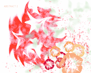
My second Photoshop abstract work was created mostly with the use of different brushes and a colour swatch I created of warm complimentary colours. Beginning with a large round brush I drew some random lines in a bright reddy/orange colour and played with the liquify tool again to create some interesting shape. I then tried out a brush that produces several shapes when you click rather than just one spot of a particular pattern. Using this brush I painted on some light pink leafy looking shapes. This formed some texture and varying tones. With the big empty space on the right I decided to stamped in the places lacking in colour with an extremely large brush. The green creates a subtle contrast in colour and fills empty space. I did this again with a different brush in a pink colour to match but this time in the bottom corner. In class we then learned how to create our own brushes and so I created the flower brushes used in the bottom right. I think these helped balance the image. The red spiky shape has lines that lead towards them and the enlarged pink brush also gets more dense as it gets closer to the flowers, drawing attention to them. I think this is a messy abstract image but takes into account colour and creating brushes which was suuper easy and cool to learn.
No comments:
Post a Comment